Websites and Conversion
What Every Home Service Website Needs to Turn Visitors Into Calls
A good-looking website is not enough. Learn the practical elements that help home service companies turn local website visitors into real customer conversations.
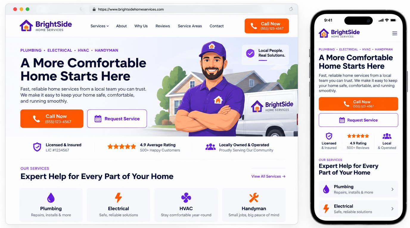
A home service website has a straightforward job. It should help the right customer quickly understand what you do, trust your company, and contact you.
That sounds simple. In practice, many contractor websites make visitors work too hard. The phone number is difficult to find. Service areas are unclear. Important services are buried. The company looks professional in person, but the website does not communicate that professionalism.
A beautiful design can create a strong first impression, but appearance alone does not generate calls. The website also needs a clear structure, convincing information, and an easy path to action.
Here are the elements every home service website should have if its purpose is to produce more customer conversations.
1. A clear answer to three immediate questions
When someone lands on your homepage, that person should not have to study the page to understand your business.
The first screen should quickly answer:
- What service do you provide?
- Where do you provide it?
- What should the visitor do next?
For example, “Reliable plumbing repairs for homeowners across North Dallas” communicates more than “Quality service you can trust.” The second statement sounds pleasant, but it could describe almost any business.
Your main headline should be specific enough to orient the customer. Your supporting copy can then explain why your company is a good choice.
2. A phone number that is easy to find and use
Many home service customers are not looking for a long research process. They have a broken spring, leaking pipe, electrical problem, pest concern, or uncomfortable home. They want to know whether someone can help.
Your phone number should be:
- Visible in the header
- Clickable on mobile devices
- Repeated near important service information
- Available again near the bottom of the page
Avoid making visitors open a contact page simply to find your number. On mobile, a clear “Call Now” button is often more useful than a decorative header.
The wording matters too. “Call Now,” “Request Service,” and “Request an Estimate” are clearer than “Submit” or “Learn More.”
3. One primary action on each page
A page can offer both calling and form submission, but it should still have a clear primary action.
The right action depends on the service:
- Emergency repair pages may emphasize calling.
- Replacement or installation pages may emphasize requesting an estimate.
- Maintenance pages may emphasize scheduling.
- Commercial pages may emphasize speaking with a specialist.
Too many competing buttons can slow the decision. If every button has a different message, the visitor may not know which one matters.
Choose the most useful next step for each page, make it prominent, and use a secondary option only when it helps customers with a different level of urgency.
4. Mobile design built for real conditions
A homeowner may visit your website while standing beside a broken garage door, sitting in a warm house, or checking a problem under the sink. The mobile experience needs to work in those conditions.
A strong mobile website should have:
- Readable text without pinching or zooming
- Large buttons with enough space to tap
- A compact, understandable menu
- Fast-loading images
- Short forms
- A phone number that starts a call when tapped
- Service information that is easy to scan
Do not treat the mobile site as a smaller version of the desktop design. It should be deliberately arranged around the actions a mobile customer is most likely to take.
Google also recommends creating an overall strong page experience, including mobile usability, secure delivery, useful content, and good performance. You can review Google's page experience guidance for the technical perspective.
5. Dedicated pages for important services
A single Services page with a short list rarely answers every customer question.
If a service matters to your business, it usually deserves its own useful page. A garage-door company might need separate pages for spring replacement, opener repair, new doors, and general repairs. An electrician might need pages for panels, lighting, troubleshooting, generators, and EV chargers.
Each service page should explain:
- What the service covers
- Common signs that the customer may need it
- What the service process generally involves
- Why the customer should consider your company
- The areas where the service is available
- How to request help
This structure is useful for customers, search engines, and AI-powered discovery tools because it makes the business easier to understand.
6. Trust information that feels real
Home service customers invite technicians onto their property. Trust is not a decorative feature. It is part of the buying decision.
Useful trust elements may include:
- Licensing and insurance information
- Years in business
- Technician qualifications
- Authentic customer reviews
- Service guarantees that are accurately explained
- Financing information, when applicable
- Photographs of the team, vehicles, and real work
- Memberships and certifications that can be verified
Avoid vague badges that look official but mean nothing. Do not display a review count that is not current, and do not use stock photographs as if they show your actual team.
Specific, verifiable information is more persuasive than a row of generic icons.
7. Clear service-area information
Customers should be able to tell whether you serve their location before they call.
A good service-area presentation can include:
- Primary city and surrounding communities
- Counties or regions served
- A short explanation of any distance limitations
- Links to useful location pages when the content is genuinely distinct
Do not publish dozens of nearly identical city pages with only the city name changed. Those pages offer little value to customers and can make the website feel manufactured.
Focus on accurate coverage information and useful local detail.
8. Short forms that match the customer’s urgency
Every additional form field asks the visitor to do more work.
For an initial service request, you may only need:
- Name
- Phone number
- Email address
- Service needed
- City or ZIP code
- Short description of the problem
You can gather equipment details, preferred appointment times, photographs, and other information later if those items are not essential to the first response.
The form should also explain what happens next. A simple line such as “We’ll contact you to confirm the details” removes uncertainty.
Never promise an exact response time unless your team can consistently meet it.
9. Fast performance and dependable technical basics
Visitors do not care why a page is slow. They simply experience the delay.
Large images, unnecessary animation, excessive tracking scripts, and poorly built page components can make a polished website frustrating to use.
The foundation should include:
- Secure HTTPS delivery
- Responsive image sizes
- Modern image formats when supported
- Stable layouts that do not jump while loading
- Working forms and links
- Clear error messages
- Basic accessibility
- Reliable hosting
- Regular updates and maintenance
Google describes Core Web Vitals as measurements of real-world loading, responsiveness, and visual stability. A perfect technical score is not the goal by itself, but a fast and stable experience helps customers use the site without unnecessary friction.
10. A response process behind the website
The website cannot convert a lead if nobody responds.
Before investing in more traffic, decide:
- Who receives new form submissions?
- Who answers incoming calls?
- What happens after hours?
- How quickly are new inquiries acknowledged?
- What happens when the first call is missed?
- How are estimates followed up?
- How are duplicate or spam inquiries handled?
A website and a lead-response process should be designed together. Sending every inquiry into an inbox nobody checks is not a conversion system.
EvōkLocal can deliver leads by text, email, phone, calendar, or an existing business system, depending on the setup. The goal is to make the process easier for the team, not force everyone to learn another dashboard.
11. Content that sounds like the company
Generic contractor copy is easy to recognize. It relies on phrases such as “quality you can trust” without explaining what the company actually does differently.
Useful website content should reflect:
- The services you want to sell
- The customers you serve
- The way your company communicates
- The questions callers repeatedly ask
- The concerns that delay a decision
- The practical reasons customers choose you
AI can help organize and draft content, but the final page should contain accurate company information and a recognizable point of view. A well-written page is clear, specific, and useful. It does not need to sound clever.
A practical homepage checklist
Before approving a home service homepage, ask:
- Can a visitor identify the trade and service area immediately?
- Is the primary phone number visible?
- Does the mobile call button work?
- Is there one clear primary action?
- Are the main services easy to find?
- Are trust claims specific and verifiable?
- Is the form short enough to complete quickly?
- Does the page explain what happens after contact?
- Does the site load quickly on a phone?
- Does someone reliably receive and respond to every inquiry?
If several answers are no, the website may be losing opportunities even if the design looks attractive.